import matplotlib.pyplot as plt
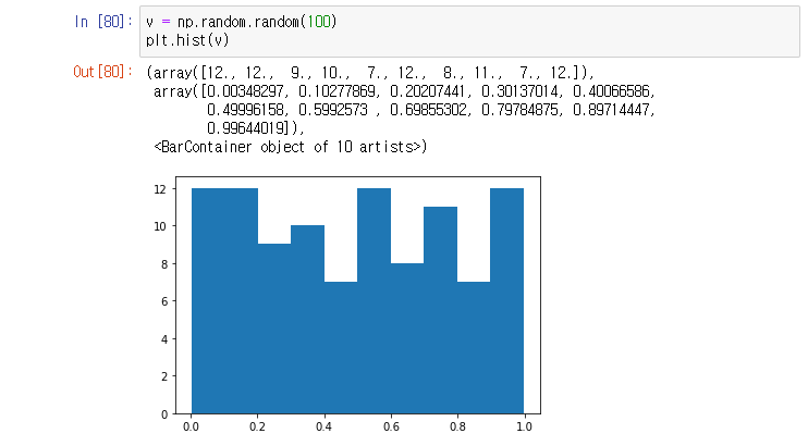
plt.hist( [list] , range = [ x axis range], bins = 10(default) , label = 'str' )
plt.legend( )
- np.historam ([list]) 는 array로만 return
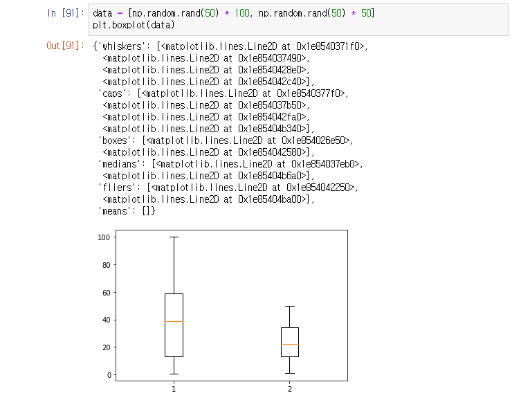
plt.boxplot( [data] )

- notch : median 값의 1sigma 신뢰구간 표현
- sym = outlier 모양 , ' ' 하면 no outlier
- vert = 0 : horizontal box, default = 1(vertical box )

- plt.boxplot([ data, data2 ...]) 도 가능
plt.figure( )
plt.subplot( )
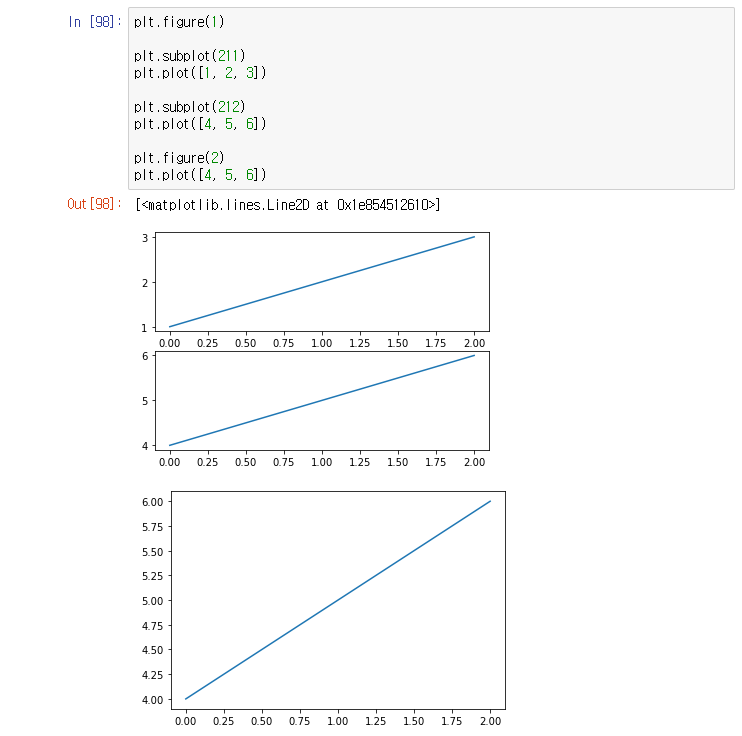
plt.clf( )
: 마지막 figure 삭제
plt.cla( )
: 마지막 접근한 figure의 마지막 subplot 삭제
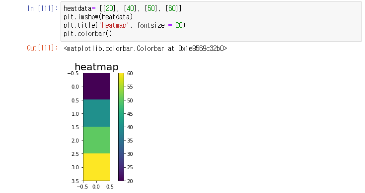
plt.imshow( [ list ] ) 좌상단 (0,0) , plt.pcolor( [ list ] ) 좌하단 (0,0) - x,y 좌표축과 동일
- 빈도수가 작으면 어두운 색, 빈도수가 크면 밝은 색
plt.colorbar()


import seaborn as sns
sns.jointplot( x, y, data)
- scatter plot, histogram 동시 확인 가능

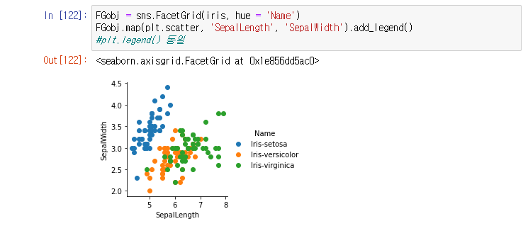
sns.FacetGrid(data, hue = 'column')
*.map(plt.scatter, 'column', 'column)
- hue를 기준으로 grouping해서 map method의 column별로 scatter plot
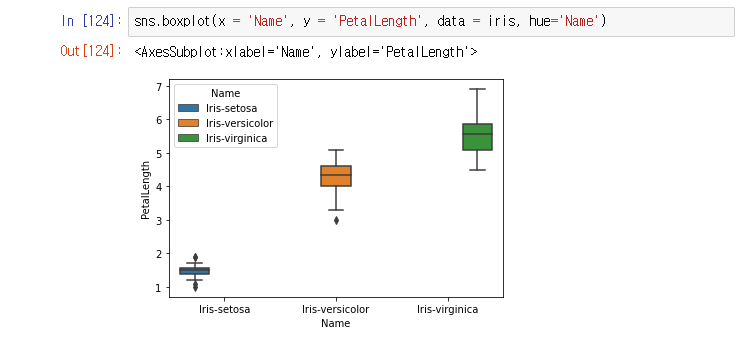
sns.boxplot( )
- x 기준으로 boxplot 그려주고, hue 기준으로 legend 생성(따로 만들 필요없음)
sns.distplot( )
- kde = False : histogram만 plot


sns.violinplot( )
- hue는 legend 자동 생성

sns.stripplot()
- plt.scatterplot()이랑 유사, boxplot(0 + violinplot()

sns.pairplot( )

'공부는 언제까지 해야 하나' 카테고리의 다른 글
| [Python] matplotlib module - bar( ) , pie( ) (0) | 2021.02.04 |
|---|---|
| [Python] matplotlib module - scatter( ) (0) | 2021.02.04 |
| [Python] matplotlib module - plot( ) (0) | 2021.02.04 |
| [Python] pandas module - File IO (0) | 2021.02.04 |
| [Python] pandas module - Time Series Data (0) | 2021.02.04 |


